
 Likes:


Thanks for the kind words. So the long winded version goes something like this:Originally Posted by christian

Eric was great to work with on his branding. The process started with his inquiry after I had designed the Oregon Handmade Bicycle Show's logo and subsequent show poster(s). I had a few conversations with him via internet and then over the phone to pick his brain on where Winter had been, where it was presently and where he was planning on going with the brand. I also asked him at length about the name itself and had him build that backstory for me to better understand it all. Most times I ask a few questions, bigger picture ones like this, and then sit back and listen. My job is to really pay attention so I can see the forest through the trees as I am an outside perspective. I know the industry well and feel I have a knack for sifting through everything to distill the main concepts.
Eric was very helpful as he had a bit of direction for me. We exchanged some inspiration type images of styles he was interested as well as some quick pencil/pen sketches. Which is great as that sets up restrictions right from the start by which the design process can thus be channeled. Too much freedom or "I don't know what I want until I see it" can lead to the designer just doing what they want to do and that might not be the best solution. This same process is applied in a fashion when I build a client a bike. Several question, followed by lots of listening and distilling. But it's important to develop concepts that are right for the client and have a bit of the designer injected into them as well so if you stand back and look at all the work you've done, a style begins to emerge however, as one logo, they stand alone by themselves and really relate to the brand it was intended for. That's tricky of course, but a signature is still present.
After those first few conversations, and a design direction is set, I take 1-2 weeks to generate concepts. I've found depending on the client, more can be dangerous as they can get overwhelmed. This is where understanding the client inside and out becomes paramount. Some like more, some like less - and you can decipher this if you ask all the right questions and do the listening I spoke about. I felt with Eric, I could pitch him 3-5 concepts and we'd narrow it down quickly. 2 safe, one dead in the middle and then 2 perhaps "out there". Most times the 4 or 5th concept is what I'm actually looking to persuade the client to going after. Other times that first round is a good way to get a reality check on your understanding of the aesthetic. (which was important on this design - I tested some waters with that first round) I leave a safe version so some of that "out there" can be funneled into that safe spot. Eric also had a certain look and feel, along with some existing art (cherry blossoms), so that needed to be updated and integrated in some fashion. So this went to about 4 or 5 rounds until we narrowed down the final design. As we moved along, he would print out some of the examples and draw directly on the concepts for me to better understand what he was after and to just brainstorm on the concepts (this was great, and is rare to have a client like this). Typically it does take 3-5 rounds of back and forth. The first 2 most likely set direction and then the last few just whittle away and narrow down the scope. Certain aspects are taken from one design and applied to the next. As I go along, one thing inspires the next and it builds momentum on itself. Often times, I'll have more than one of these projects going at once which takes some care but really helps to drive each of the separate design projects as I can put one away for a few hours and work on something else, then come back to another. Sometimes I'll actually be down in the shop, change gears and come back up to the studio and nail the design in a few minutes or it can happen the other way around too. Design stops, and bikes get built even better.
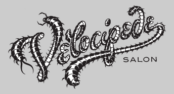
But flourish without over doing it was also a key take away and general design requirement. These "phases" can be quick or take some time to nail down, again, depending on the client. Some can be really picky, and really sweat the details. Which is fine, but it just requires more patience. Eric "gets it" so he was really great to work with - he let me do my job and I listened to what he wanted and delivered what he needed. I think the end result really speaks to the Winter brand as a whole, but brought it to that next level, and really tightened up the presentation so each Winter is a stand alone piece, but relates back to a family of objects. The essence was always there, but his original DT Script was pretty stiff looking. His work has a lot of flow, utility too, but lots of flow and harmony. I tried to inject that into the design as well.
I'll inquire with Eric, but I have pretty much all of the rounds of the work from start to finish and may be interesting to post up as a downloadable link so everyone can see where his branding started, where those little moments in space start to gel, and then wham, (in this case Round 5) he's got his logo/s. The icon he uses actually happened in Round 4 of the design, and the script happened in the round after that almost immediately.

 Reply With Quote
Bookmarks