User Tag List

Page 1 of 3 123 LastLast
Results 1 to 20 of 53

Thread: House Industries

  1. #1
    Join Date
    Jul 2008
    Posts
    186
    Post Thanks / Like
    Mentioned
    0 Post(s)
    Tagged
    0 Thread(s)

    Default House Industries

    House Industries formed in the cultural vacuum of the early '90s when corporate excess and a digital euphoria left letterers, illustrators and production designers fired, retired, retrained or reassigned. Graphic design had become an elitist profession where many practitioners saw themselves more as artists than tradespeople. Unfortunately, the talented journeymen on whom they depended saw their profession suffer a perceived obsolescence from the notion that software and computers could replace their skill, experience and muscle memory. This void left an opportunity for Andy Cruz and I.

    Andy had lifetime of influence from his meticulous professional hot-roddding father and a vocational technical high school instructor who insisted on drilling the basics before letting kids into the Mac lab. I had a somewhat useful college degree in communications, a largish apartment with a liberal landlord and a Tourettic middle finger that prevented me from keeping any sort of long term employment. We found ourselves working together at a small Wilmington design firm, got hired away by a software company and subsequently picked up our first design client, a South Chicago carton manufacturer with lots of patience and a willingness to give us the keys to their production facility. We quit our jobs, took a vow of poverty and named our new outfit Brand Design Co., Inc.


    While clients and print sales reps wanted to go out to three hour lunches, Andy and I preferred to hang back with the press operators to learn the intricate lithographic relationship between ink, pressure, speed and paper. We first made our bones on an international stage with a deep mixing bowl of cultural clues and cultivated relationships with the people who actually ran the machines that produced our work. Our early projects stood out because we were willing to dig deeper, stay poorer and draw more while most of our contemporaries were content to contain their influences and results within the digital confines of a cathode ray tube and the narrow minds of their clients.


    Early in 1994, Andy and I found ourselves staring at each other wondering where our next paycheck was coming from when we decided we needed a paper company as a client. Lots of our contemporaries were socking away six figure retainers extolling the virtues of countless white hues with incredibly self-serving promotions, so we wanted in on the gravy train. We figured the best place was to start at the bottom, so we dug out the ugliest paper swatchbook we could find and cold called the company's marketing director. By some stroke of luck he picked up the phone, had recently lived in Delaware and was in a generous enough mood to throw us a bone. The name of the company was Custom Papers Group, and their highest profile product was a leatherette-embossed sheet used as the cover of the M-16 manual.

    Andy's talented vo-tech classmate Allen Mercer, who had delayed his entry into the real world by matriculating at a prestigious art school, foolishly turned down several lucrative job offers to join us as a partner (partner is defined as someone who works really hard but does not collect a paycheck). Still not over his BFA brainwashing, Allen lectured us on the importance of a well developed concept before starting work on a new project, which in this case was "Custom Papers = Custom Cars + Custom Lettering." This low brow approach took our heads out of the mercurial world of graphic design and forced us to look elsewhere for ideas, mostly from Andy's dad's collection of pre-digital era car magazines and 1/25th scale model kits. At first we were just looking for automotive influence, but what we found was a poignant reminder that professionally drawn display lettering made even the most mundane editorial pieces and advertisements look so much cooler. We fed the obsolete notions of hand-drawn headlines, traditional commercial art techniques, elbow grease, graphite, india ink and vellum into our inspirational sausage blender and out came the distinctly illustrative layered lithographic layouts that defined our Custom Papers Group promotions. This extensive research and development phase would later bear fruit as fodder for our elaborate theme-based font collections.


    Andy and I did not much like working for clients. They imposed deadlines, wanted a say in the visual composition of their final product (imagine that) and dangled just enough money to keep us hunting for the next hustle. Hence the need for independent recurring income. Since we had drawn several custom alphabets for various clients, we thought we would try to develop some digital fonts and sell them to unsuspecting customers. We did not want the almost certain failure of this new venture to reflect negatively on our semi-successful design company, so we cooked up the name House Industries and cobbled together a logo from a printer's clip art sheet. Our amazing new product was a collection of ten display "fonts" based on lettering for our growing portfolio of commercial design projects. We bummed free paper from Custom Papers Group, traded Quark Express training at the local print shop and created our first font promotion. Andy's little brother Adam came over every day after school and typed in the names and addresses of those who appeared in the 1993 Communication Arts Design Annual. We printed out labels, slapped on stamps, dropped a bag at the post office and lamented about the good paper we'd just wasted.


    The art director from Warner Brothers Records called a few days later: "These fonts are great! Can you Fedex a disk right away?" Andy pushed the hold button, handed me the receiver and asked "What do we do?" The problem was we had only drawn enough letters to spell out the name of each font. I picked up the phone and said something like "Well, if you read the small print on the back of the mailer you'll see that you need to allow four to six weeks for delivery sorry about that could you spell your name please." Fortunately she had a good sense of humor and became customer number one while we taught ourselves Fontographer and accounted for the countless permutations one must consider when designing working typeface.


    All of those things happened in a relatively short period of time about 18 years ago, but those events formed the basis of how House Industries operates today. Any profit from that first font collection was reinvested in making more fonts, hiring people whose alphabetic aptitude exceeded our own and creating complex marketing promotional tactics. Things haven't changed much. A bleary eyed Andy Cruz just walked into the studio after spending 30 straight hours bro-ing down with press operators, sniffing ink and paper dust while babysitting every form of our new 100-page catalog. And we're investing most of our current sweat equity and spare change in photolettering.com, which is an untried and untested populist online application offering well-formed semi-custom lettering accessible to anyone with an internet connection and seven bucks.


    Good design, carefully-engineered typography and professionally-drawn lettering are not going to save the world. We are, however, products of our environment, and much of our man-made cultural commercial landscape has become exceedingly ugly. Look around and you'll see that Mike Judge's Idiocracy (released in 2006) has become oddly prophetic in that our collective conscience has been traded on the stock market in exchange for short term capital gains and long-term visual blight. I'd like to think that House Industries has at least a slowing effect on this trend.

    Thanks for reading.
  2. #2
    Join Date
    Jun 2008
    Location
    Seattle, WA
    Posts
    2,404
    Post Thanks / Like
    Mentioned
    9 Post(s)
    Tagged
    0 Thread(s)

    Default Re: House Industries

    so where do bikes fit in the grand scheme of things, rich? i know i've sent a few frames your way - what plans or purposes do you have there?
    Steve Hampsten
    www.hampsten.blogspot.com
    “These are my principles. If you don’t like them, I have others.”

  3. #3
    Join Date
    Jun 2009
    Location
    Miami
    Posts
    550
    Post Thanks / Like
    Mentioned
    0 Post(s)
    Tagged
    0 Thread(s)

    Default Re: House Industries

    Keep the flame alive. I love your work.

    Long before I became a designer I got my start in the printing industry as a teenager and learned color separations when you made corrections by etching the film with cyanide and developed the films in a tray after multiple exposures through filters. Typesetting was a respected craft back then with thousands of craftsman dedicated to nothing else but typesetting.

    I visit your site often to admire the forms and style. Keep up the excellent work. It's so important to have artists doing this sort of stuff. It's truly uplifting in a world buried in soulless shit.

  4. #4
    Join Date
    Aug 2009
    Location
    Portland, OR
    Posts
    253
    Post Thanks / Like
    Mentioned
    0 Post(s)
    Tagged
    0 Thread(s)

    Default Re: House Industries

    House Industries has inspired me for years. Awesome to see you here, too.

    < like button goes here >
    /Andy A

  5. #5
    Join Date
    Aug 2008
    Location
    White Ga 30184
    Posts
    3,630
    Post Thanks / Like
    Mentioned
    0 Post(s)
    Tagged
    0 Thread(s)

    Default Re: House Industries

    luv your art / design --- framed and on hang in our home..

    ronnie

  6. #6
    Join Date
    Jul 2008
    Posts
    186
    Post Thanks / Like
    Mentioned
    0 Post(s)
    Tagged
    0 Thread(s)

    Default Re: House Industries

    Quote Originally Posted by hampco View Post
    so where do bikes fit in the grand scheme of things, rich? i know i've sent a few frames your way - what plans or purposes do you have there?
    Maybe I should give a brief history. A very talented type designer friend of mine, Paul Barnes, had this idea that we should create a bicycling-themed set of fonts. He was the one who picked up the phone and called Steve to see if we could somehow get the Hampco involved. That was what, about five years ago, and the fonts have yet to materialize. Paul did a little redraw on the Hampsten logo, then we took a stab at a script version and Steve has graciously supplied Ben Kiel, Paul and I with some of his addictive two-wheeled crack. I have to tell you Steve, the bike you built (I'm gonna get those graphics on soon...sorry. Also, I've since fitted the fenders and lost the crappy seat bag) for me has made me drop a much needed 15 pounds because all I want to do is ride it. You may have saved my life.

    We're going to do those fonts, hopefully tie in some non-gratuitous cross branding and generally try to create an alphabetical tribute that is worthy of your craftsmanship.

  7. #7
    Join Date
    Jul 2008
    Posts
    186
    Post Thanks / Like
    Mentioned
    0 Post(s)
    Tagged
    0 Thread(s)

    Default Re: House Industries

    Quote Originally Posted by henry g. View Post
    Long before I became a designer I got my start in the printing industry as a teenager and learned color separations when you made corrections by etching the film with cyanide and developed the films in a tray after multiple exposures through filters. Typesetting was a respected craft back then with thousands of craftsman dedicated to nothing else but typesetting.
    Shoosh, we put some nasty stuff down the drain back in the day, didn't we. I'd still love to proof print jobs from bluelines and progressive proofs burned directly from the films, but I'm also glad we've eliminated some of that toxic stuff from the production process. I was a writer for The Review (U of D student newspaper) and one of my jobs on deadline was running out galleys from our Compugraphic typesetter and doing paste up. I got a job in the marketing department of United Way of Delaware right out of school. They had just purchased two double floppy Mac SE's with Pagemaker 1.0, then completely cut their design budget. You had to boot up the system with one disk, then pop it out and put in the application disk to load Pagemaker so you could use the other drive to save your doc. I spent a lot of late nights working at the dawn of the digital publishing revolution.

  8. #8
    Join Date
    Jul 2008
    Posts
    186
    Post Thanks / Like
    Mentioned
    0 Post(s)
    Tagged
    0 Thread(s)

    Default Re: House Industries

    Quote Originally Posted by a-game View Post
    House Industries has inspired me for years. Awesome to see you here, too.
    The Richard asked me to do this months ago and the thought of posting up amongst the world's best velocisculptors gave me some severe agita. It is truly an honor.

  9. #9
    Join Date
    May 2008
    Location
    Better to be ruined than to be silent atmo.
    Posts
    22,140
    Post Thanks / Like
    Mentioned
    24 Post(s)
    Tagged
    0 Thread(s)

    Default Re: House Industries

    Quote Originally Posted by richroat View Post
    The Richard asked me to do this months ago and the thought of posting up amongst the world's best velocisculptors gave me some severe agita. It is truly an honor.
    okay we can still hang atmo.


  10. #10
    Join Date
    Jul 2008
    Posts
    186
    Post Thanks / Like
    Mentioned
    0 Post(s)
    Tagged
    0 Thread(s)

    Default Re: House Industries

    Quote Originally Posted by ron l edmiston View Post
    luv your art / design --- framed and on hang in our home..

    ronnie
    Thanks for reading....glad you like the serigraph! We're stoked every time someone purchases one of those prints, because that little sideline pretty much props up our Grand Rapids skunkworks and keeps our old friend David Dodde's squeegee hand in shape.

  11. #11
    Join Date
    Jul 2008
    Posts
    186
    Post Thanks / Like
    Mentioned
    0 Post(s)
    Tagged
    0 Thread(s)

    Default Re: House Industries

    [QUOTE=e-RICHIE;300681]okay we can still hang atmo.


  12. #12
    Join Date
    Jun 2008
    Location
    United States
    Posts
    3,015
    Post Thanks / Like
    Mentioned
    5 Post(s)
    Tagged
    0 Thread(s)

    Default Re: House Industries

    House Industries does distribute some darn nifty prints suitable for framing!

  13. #13
    Join Date
    May 2008
    Location
    Dirtville
    Posts
    10,721
    Post Thanks / Like
    Mentioned
    17 Post(s)
    Tagged
    0 Thread(s)

    Default Re: House Industries

    hey rich,

    thanks for taking time to get smoked out. i've got a few of your prints hanging here in d-ct land.

    cheers

  14. #14
    Join Date
    Jun 2009
    Location
    Miami
    Posts
    550
    Post Thanks / Like
    Mentioned
    0 Post(s)
    Tagged
    0 Thread(s)

    Default Re: House Industries

    Quote Originally Posted by richroat View Post
    Shoosh, we put some nasty stuff down the drain back in the day, didn't we.
    That's an understatement. We used Carbon Tetrachloride to clean film and carbon arc lamps that out gassed as they burned off to expose plates. After years of breathing the fumes from that stuff I'm amazed I have all my organs intact. The only thing I miss of all that chemical mess are the dye transfer prints and larger format Kodachrome films. The look photographers could get from that stuff was amazing.

  15. #15
    Join Date
    May 2008
    Posts
    7,157
    Post Thanks / Like
    Mentioned
    1 Post(s)
    Tagged
    0 Thread(s)

    Default Re: House Industries

    Rich,
    I'm perpetually thinking about what I'd do to improve my dt logo on my frames. I've looked at many sites including yours for font ideas but all I've found is paralysis. In general what are some steps a person could use to filter the info and head in the right direction? With a new customer how do you start out and match brand to typeface?

  16. #16
    Join Date
    May 2008
    Location
    DC
    Posts
    29,824
    Post Thanks / Like
    Mentioned
    58 Post(s)
    Tagged
    0 Thread(s)

    Default Re: House Industries

    Rich, Ben and to the crew. House Industries does make a difference and your influence on so many things raises our collective abilities to appreciate beauty in design and more. Yeah, you matter.
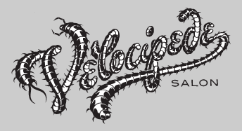
    Did I mention generosity? This seems to be a running theme with your crew, really takes me back at times. When you offered to design the VelocipedeSalon Logo "Badness" I was pretty speechless and the work really is stellar. Yah didn't have to do that but you did. Mench.

    In life we all work overtime to surround ourselves with people who are able to give back some of what we "put out there" and House Delivers the goods in spades, letterset and goodwill every-freakin-time. Mi Casa Su Casa bro.

    PS - What would you think about doing a little pinstriping on my pickup truck ? Trades for beers and BBQ Jerk fish??

  17. #17
    Join Date
    Jul 2008
    Posts
    186
    Post Thanks / Like
    Mentioned
    0 Post(s)
    Tagged
    0 Thread(s)

    Default Re: House Industries

    Quote Originally Posted by DarrenCT View Post
    hey rich, thanks for taking time to get smoked out. i've got a few of your prints hanging here in d-ct land.
    Quote Originally Posted by Blue Jays View Post
    House Industries does distribute some darn nifty prints suitable for framing!
    Thanks for the love on the prints, guys. We hope to keep those going.
    Last edited by richroat; 05-25-2011 at 08:43 AM. Reason: Doop!

  18. #18
    Join Date
    Jul 2008
    Posts
    186
    Post Thanks / Like
    Mentioned
    0 Post(s)
    Tagged
    0 Thread(s)

    Default Re: House Industries

    Quote Originally Posted by Jonathan View Post
    Rich,
    I'm perpetually thinking about what I'd do to improve my dt logo on my frames. I've looked at many sites including yours for font ideas but all I've found is paralysis. In general what are some steps a person could use to filter the info and head in the right direction? With a new customer how do you start out and match brand to typeface?
    Since your DT logo is so long, you're probably moving in the right direction by picking something typographic instead of illustrative. There are so many good typefaces out there right now, you could spend days picking through online testers to see what works. My partner, Andy, always says "Squint at it, and see if it still looks good." Some of my favorites:

    Commercial Type
    HFJ
    Font Bureau

    If you find something you like, buy the family, then start printing it out at size and stare at it some more. I don't think there is any filter besides your own aesthetic sense, which is obviously keen judging from the bicycles you build.

    To address your customer question, we have never really worked that way. Most of our typefaces come from concepts we cooked up in the studio, not from client requests. We just draw it up, put it out there and see if anyone bites.

  19. #19
    Join Date
    Jul 2008
    Posts
    186
    Post Thanks / Like
    Mentioned
    0 Post(s)
    Tagged
    0 Thread(s)

    Default Re: House Industries

    Quote Originally Posted by henry g. View Post
    The look photographers could get from that stuff was amazing.
    We did a series of Phish European tour posters with fluorescent inks in 1998. It took us three days and four different kinds of 4 x 5 film to pick up those colors. You remember the drill. Shoot the Polaroid, tweak the composition, then shoot a bunch of 4 x 5s, send the assistant to the lab, order pizza, send the assistant back to the lab, put trannies on light table. Repeat the next morning.

    Digital is so much easier, but even our photographer's Hubble telescope Scitex large format back cannot pick up the richness of film.

  20. #20
    Join Date
    Jul 2008
    Posts
    186
    Post Thanks / Like
    Mentioned
    0 Post(s)
    Tagged
    0 Thread(s)

    Default Re: House Industries

    Quote Originally Posted by Too Tall View Post
    Rich, Ben and to the crew. House Industries does make a difference and your influence on so many things raises our collective abilities to appreciate beauty in design and more. Yeah, you matter.
    Did I mention generosity? This seems to be a running theme with your crew, really takes me back at times. When you offered to design the VelocipedeSalon Logo "Badness" I was pretty speechless and the work really is stellar. Yah didn't have to do that but you did. Mench.

    In life we all work overtime to surround ourselves with people who are able to give back some of what we "put out there" and House Delivers the goods in spades, letterset and goodwill every-freakin-time. Mi Casa Su Casa bro.

    PS - What would you think about doing a little pinstriping on my pickup truck ? Trades for beers and BBQ Jerk fish??
    Thanks for letting us bug up your forum with all of those legs and body segments. That was a fun one. At least for me to watch.

    Angelo Cruz, Andy's dad, is the striper. You can watch his work here around 1:30. He also built one of the coolest 32s:


    You would go nuts in his garage. Bring that jalopy up here some weekend and I'll see if I can square it with him.

Page 1 of 3 123 LastLast

Bookmarks

Bookmarks

Posting Permissions

  • You may not post new threads
  • You may not post replies
  • You may not post attachments
  • You may not edit your posts
  •